Helping Clients Visualize the Effects of Screen Resolutions on Design
Published by John on October 17, 2012 Under Web DesignWhile working with graphics designers, webdesign firms, and individual clients, I find that it can sometimes be difficult to visualize how a computer’s display resolution corresponds to an image mockup or website design.
It is not uncommon to see designs that look great in PSD and in an image viewer, but don’t translate as well to a webpage. Having too much vertical scroll is something that many people don’t notice when viewing the image mockup, probably in part due to image scaling and not viewing the image at 100% size.
Many people still want their content to be ‘above the fold,’ but also want a 400 pixel tall slideshow and 100px tall header.
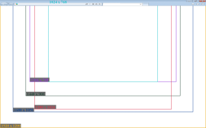
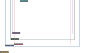
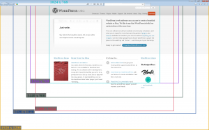
In order to help clients better visualize how screen resolution is related to what a person sees when they view a webpage in their browser, I created the below images.
The following images can be placed over a design in order to help visualize how it might look in different resolutions, with a few of the more common desktop and laptop display sizes used.
Realistically, this includes only a handful of resolutions, but I think it probably has enough of the common ones, to provide a general idea of how a design translates to a computer monitor.
Taking into Operating System Bars and Browser Toolbars
I included a version with an Internet Explorer bar across the top of the page.
However, it is important to keep in mind that a portion of the bottom will also be typically be taken up by the bottom of the browser and the Operating System’s bottom dock.
In addition to taking into account the top/bottom of the computers screen, which will reduce the amount of browser real estate available for a webpage, many people often end up with a toolbar or ten installed, which can further decrease the amount of space available.
But Everyone Has a Widescreen
The 1366 by 768 resolution is probably one of the more common ones right now, due in no small part to how many low-cost laptops from big-box stores have this resolution. Even though this is widescreen, about 16:9, it is not very tall. The height compares to 1024 by 768, so in some ways it is a step backwards.
It is probably true that the wide-screen resolution in general is much more common. However, you can’t ignore all the other resolutions. For example, I often do computer repairs and find that people have set their resolution of their nice 21 inch wide-screen monitor to 1024 by 768, so they can read the text. It is also important to take into account mobile browsers.
A big part of it, I believe, comes down to the type of people that use the website. For instance, a website that is geared towards gamers could probably go with a much wider than normal design and it work for most of their users. On the other hand, a government website that has a much more diverse user-base would need to be more conservative.
Ultimately, in many cases it is not the width that people are worried about anyway, but the vertical scroll and with the popularity of the 1366 by 768 resolution, height can be a big factor.
Why Not Go Responsive
This is a good point and important question. Perhaps even a better question then how to explain resolutions to a non-technical individual. A Responsive Design, of which the fluid design falls into, can be a good choice. I think many developers and designers are moving towards this as smart-phones and mobile browsing become more popular and powerful.
One place it works really well is with a forum, with vbulletin’s vb4 style being a good example of how a fluid design can work well across various resolutions. However, it can present some issues and challenges, especially in regards to certain fixed-width images and graphics. It is a good deal harder to design and develop a effective responsive design, which presents several cost barriers.
Even when using a responsive design, depending on the method, a browser/client specific style may be loaded and so considering screen size/positions is still relevant.
Empty Templates to Put Over Designs
The following can be placed over a mockup to help show how the design might look at various resolutions.
The above image includes a stretched browser bar across the top, to show how some space is lost to the browser. Bear in mind there will also be space taken from the bottom of the screen for the Operating System’s bar.
The above image does NOT have the browser bar, so it is probably not as accurate, but will work well for horizontal scroll, as well as giving an idea of vertical scroll.
Suggestions for Improvements
I have made a similar image to the ones above on multiple occasions, to help explain how a design will look in a browser. I have found that often, likely because people are used to it with televisions and due to the way computers are marketed, the size in inches is used to describe how they want it to fit. IE, the client might say, I want it to look good on a 19 inch monitor.
Presenting the resolution, with a possible size of a monitor, as well as a percent of how popular the resolution is is one way this is improved. Another is improving the colors and layout, as it can be a little difficult to read and it is kind of ugly.
I am open to suggestions as to a better way to help non-technical people visualize this and, although I did not find anything really promising when I searched, perhaps there is a service or javascript class for this already.
No Comments |


Add a Comment